After viewing the videos linked to me from the CyberARTS blog I have concluded that music videos over the decades have moved farther and farther away from being an entertaining visual with the music to now be separate works of art in their own right.
I consider some of the more recent ones works of art as apposed to past ones. Even though some of the past videos for example talking heads were used in art shows I still believe that people only thought they were fantastic because they were using new technologies, not because of artistic value.
Obviously the quality and sophistication of the videos have increased over the decades as people have gotten better at using them and they have improved themselves.
Arcade Fire as improved from the decades because it has full branched out from happy people dancing to the music and has full told a story separate to the music.
In my opinion music videos are going to continue to become more and more pieces of their own and no longer be created to accompany the music, but the other way around.
Thursday 23 April 2015
Wednesday 8 April 2015
Daily Create #5

Tuesday 3 March 2015
Daily Create #4
Interesting shot of a plastic object I've used today. Thought it was an interesting view of a water bottle.


Daily Create #3
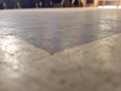
An interesting slice of of the dirty grid tiles we have the lab here at CyberARTS! :p

Daily Create #2
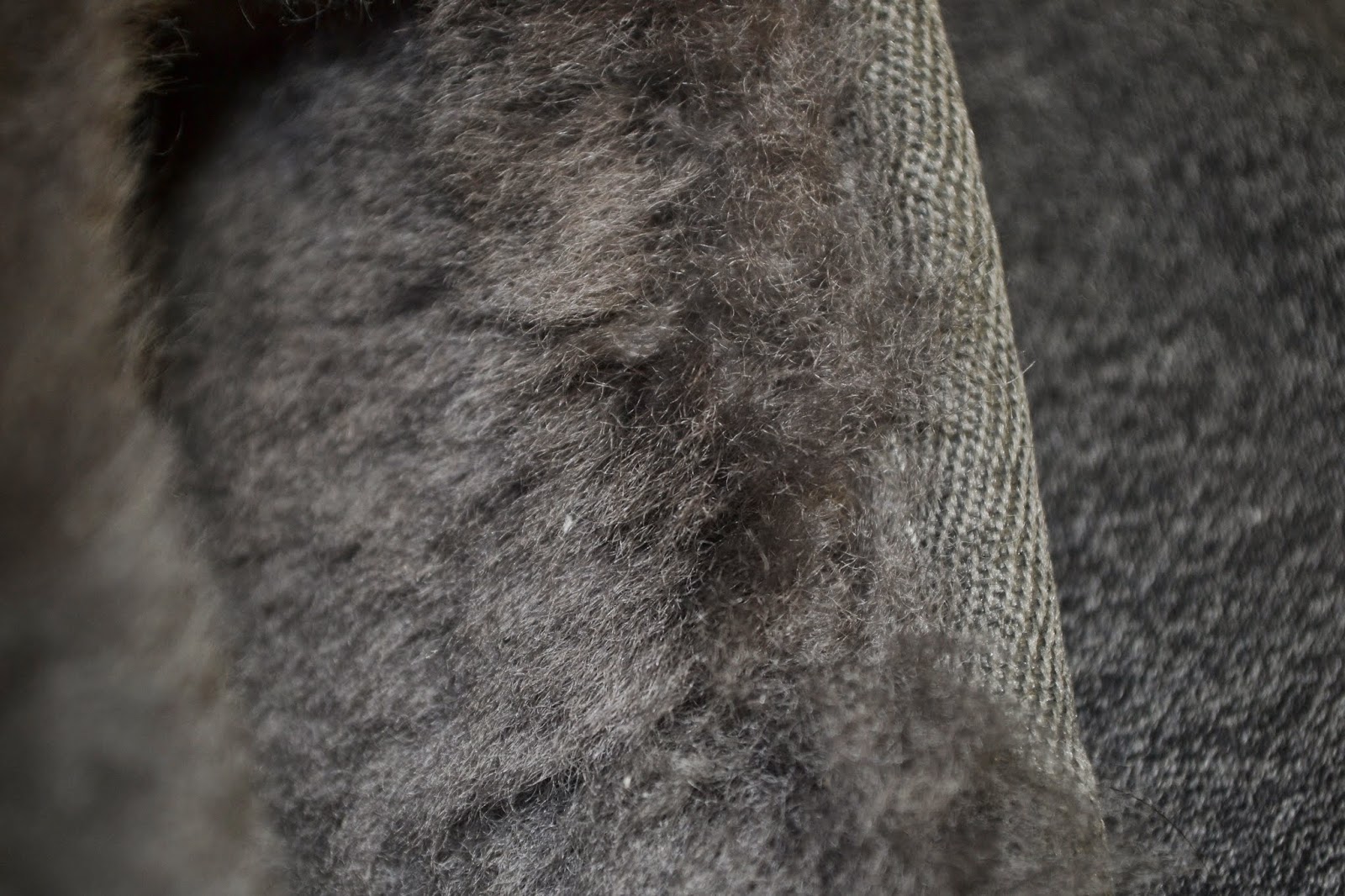
Another Fabric. I chose to do this because I really like knit material because of how much it can very. Needle point size,knit and pearl. There are so many different ways to do it.


Monday 9 February 2015
Wednesday 4 February 2015
Logo Design

This logo meets all of the five principals of effective logo design. The first is simple and this logo is defiantly that. With just one colour used not including background this logo could go from screen, to print, to even stamp if the company were to choose. This also makes the logo versatile. The logo has some small details, but they are not complex or necessary to the logo which still allows for resizing. In my opinion the logo is timeless because the imagery is so symbolic and common. I do believe the logo to be appropriate for the company as they specialize in selling organic fruits and the theme and imagery of the logo are both very natural.
The logo is very balanced only because the bird is standing on the middel of the log and the text within the log is centered. Only natural lines and used which is appropriate as the company is all about organics. Although the logo is balanced it is not symmetrical which i think is great as it is ascetically pleasing.
This logo meets all of the five principals of an effective logo. It is obviously simple and and memorable. It is versatile because of its simplicity and it is obviously timeless as its a symbol that everyone could recognize and it doesn't tie into anything special to the current time. It is appropriate because it is a continuation of the company's name twitter.
Despite the asymmetrical design the logo is still balanced because the end of the tail is just as far from the center as the end of the beak. It is all one colour thats is not to bright or overpowering and at the sametime is not to dull.
Monday 16 June 2014
Video Self Portrait - Culminating
The video starts with my morning alarm that wakes me up in the morning and ends with my drive home from school. I ended the piece at that end of my school day because it is the longest part of my day hence the title.
Some shots are blurry for example the morning alarm shot. I did this to visually represent the parts of my day that are most exhausting, confusing, and tiring. I did not add any extra music to my video because I felt that the normal sounds and voices of my day would be the best fit.
The only exception to this was an enhanced alarm sound at the beginning of my day.
My video has a title intro to start, but abruptly ends I did this because the start of my video is that start of my day, but the end of my video isn't that en of my day it is just the end of the longest part of my day.
Thursday 22 May 2014
"I shall call him squishy..."
In my story board I planned to have the text spiral out at the end instead of flick to right. But i couldn't make this work out the way I wanted to. I tried but i couldn't make it look the way I wanted it to.
I over came this challenge by changing my original design to something simpler and something I knew I could over come.
This is my completed work over to the right. Enjoy!
Monday 12 May 2014
Mini Photo Portfolio from Downtown Toronto using
 |
| Depth of Feild |
 |
| Contrast |
 |
| Dominance |
 |
| Dominance/Contrast/LeadingLines/Depth of Feild |
 |
| Rule of Thirds |
 |
| Leading Lines |
 |
| Colour Contrast |
 |
| Rule of Thirds |
 |
| Rule of Thirds/ Contrast |
 |
| Rule of Thirds |
Subscribe to:
Posts (Atom)