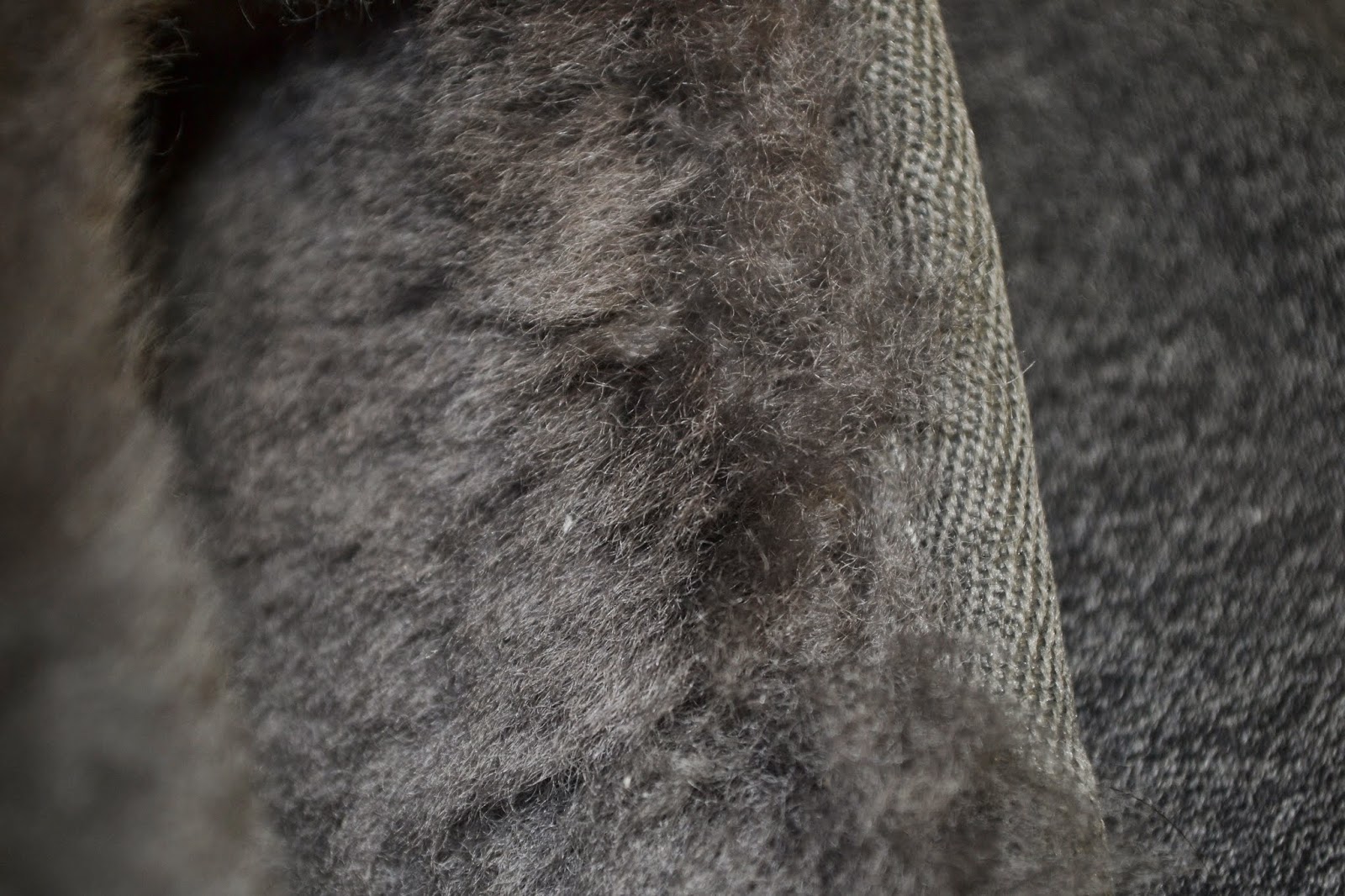
Can anyone guess what this texture is?
Monday 9 February 2015
Wednesday 4 February 2015
Logo Design
This logo meets all of the five principals of effective logo design. The first is simple and this logo is defiantly that. With just one colour used not including background this logo could go from screen, to print, to even stamp if the company were to choose. This also makes the logo versatile. The logo has some small details, but they are not complex or necessary to the logo which still allows for resizing. In my opinion the logo is timeless because the imagery is so symbolic and common. I do believe the logo to be appropriate for the company as they specialize in selling organic fruits and the theme and imagery of the logo are both very natural.
The logo is very balanced only because the bird is standing on the middel of the log and the text within the log is centered. Only natural lines and used which is appropriate as the company is all about organics. Although the logo is balanced it is not symmetrical which i think is great as it is ascetically pleasing.
This logo meets all of the five principals of an effective logo. It is obviously simple and and memorable. It is versatile because of its simplicity and it is obviously timeless as its a symbol that everyone could recognize and it doesn't tie into anything special to the current time. It is appropriate because it is a continuation of the company's name twitter.
Despite the asymmetrical design the logo is still balanced because the end of the tail is just as far from the center as the end of the beak. It is all one colour thats is not to bright or overpowering and at the sametime is not to dull.
Subscribe to:
Posts (Atom)


