Monday 10 December 2012
Tech.Post #9 (3-6-9) Assignment
Wednesday 28 November 2012
Tech. Post #6 “How do I create a photographic art piece, in the surrealist style, that has a meaningful message?”

I
created a photographic art piece that displays many of the elements and
principles of design, but some of the most relevant principles I used were,
unity, contrast and well-used colour balance. I used mainly used organic
colours, which have the tendency to compliment each other. I used the black
background not only as part of my meaning, but it also compliments and unifies
the black and other not so organic colours in the motherboard. I used colour to
create contrast with the globe, grass and motherboard. I didn’t realize until I
put all my photos in the image that the colours contrasted and unified the
image, it wasn’t intentional at first, but once I realized it was a possibility
I went for.
I
used the surrealist style in two big ways. The first way was instead of a
satellite image of the earth, I used a globe and aimed hot lights at it to try
and simulate the way the suns rays and light fall upon the earth. The other way
I used surrealism was with the grass and motherboard on South America and
Africa.
The
message behind my piece is very simple, but does need some explaining. My
message is that with all the new technologies, we are destroying our natural
world to create a tech. world. The background is black because as far as human
kind knows, after we destroy earth we won’t have anything else. Nowhere else to
go or live and we will all die faster then we think. Not many people our
focused on changing our bad habits of because they like the fact that they can
hide behind their phone and not have to face the truth. Just as I manipulated
my photos into one photo, mankind is manipulating our natural resources and the
ability to use the Internet for what it’s meant. Information. Not for
Misinformation. I used the grass on
Africa because a lot of Africa is still living of the land and Mother Nature. I
put the motherboard on the Americas because they are a lot more tech forward
then other parts of the world and is North America doing a lot of the damage
and just not carrying.
In
terms of the technical aspect of my photo I have one major flaw I would like
improve, a problem I overcame and the discovery of new Photoshop tools that I
found to be not only interesting, but every helpful too. The major flaw I
notice was in the early stage of photography when I took the picture of the
globe and didn’t get all of the globe, I attempted to fix this by lowering the
globes position on my image so it would look more intentional. Next time I do
an assignment similar to this is make sure my object is fully in lense and maybe
using the cove. A problem that occurred
but I managed to overcome was I didn’t take the photos with the same light
source this became a problem once I started to layer the images. I fixed this
problem by lining up all the light sources to make it unnoticeable. I
discovered and was taught quiet a few more tools in Photoshop that I fond very
helpful while making this image. One of these tools was the mask. I helped me
not destroy my images, but still be able to remove backgrounds. I also really
liked the blending modes where I could make something transparent and make it
exactly how liked it to be. The technical and production of my image I found to
be both fun and informative.
Monday 22 October 2012
Post #5 Composition in Photography

I think my image is visually interesting because of the angle the image was taken, the use of rule of thirds technique and the bright and rich colours. The angle the photo was taken isn't parallel to the goal post. This is visually interesting because even though the back post line is on an angle it is still following the rule of thirds. Another way this image is a display of the rule of thirds is because the object of the image(the girl in the pink sweater) is on the right hand bottom cross line of the 9 boxes. When the image was taken the focal point was not on the rule of thirds, using photoshop I cropped the image to create this.The girl is also a focal point because her pink sweater creates great contrast against the whole image and its organic colours. These colours used to be washed out, but with the help of photoshop and the use of colour boost I made the colours look richer and brighter, like a very sunny day, even though this image is was taken on a cloudy day. I took this image with the intent of the pink sweater making pop and I think after my photoshop edit I made my intent even better. I wanted to display dominance while still adding other compositional techniques to make my audience really look further, but look further in a certain order which I control with the dominance displayed in the image.
If I could retake this image I would take it from a lower angle, so the viewer could see the expression on my focus's face. I might use photoshop in a different way and play on the fact it was a cloudy day. Maybe create an image of loneliness or sadness instead of just high contrast sunny day simple everything is okay kinda fell.
Chess Piece Drawing Review


 The image above is a drawing of a chess piece and a background which is a play on the grad technique used to draw images in an easier simpler way. As part of my assignment I had to try different techniques to copy my hand drawn work into a digital for in the most successful way. This is why I have three images of the same drawing. The first one is a scan image with some photoshop improvements. I think this was an effective way to copy my work because a photograph a it sometimes creates a shine from the burnishing and adds a highlight that shouldn't be there. The second image is a photograph of my image using a copy stand. I do not think this was an effective way to copy my work for two reasons. One, the bright hot lights create a yellow tint on my drawing which is not supposed to be there. Secondly, the bright lights also create an extra highlight by flashing back light right into the camera lens where there is some burnishing. The third image is another photograph taking outside where there is softer light. This way my I wouldn't get the yellow tint or the burnished highlight. I think this technique was more effective than the copy stand, but for this specific image I think that the scanned image was the most effective. I think this because the scan image captured all of my detail, while the outside image did not.
While I was planing this drawing I wanted to make it visually interesting. I did this by modifying the technique of drawing with a grid. I drew the pawn using a grid and then took individual sections of the grid and copied them somewhere else on the page. Sometimes rotating or flipping the section to make the viewer look further. I used value to show light. I think I did this well because my drawing has large value scale with deep blacks and shades of white. The lines used in the chess piece its self are very confident and polished. While the lines used to draw the grid are confident and polished, but are very light because I had originally had the intensions of erasing those lines but once the piece was finished i decided that it would be best if the lines stayed.
Thursday 11 October 2012
Tech. Post #4 Composition in Photography

www.corbis.ca
This picture displays movement in a very interesting way because the first windmill is appearing still, but as your eyes move to the right the windmills appear spinning faster. This picture does a great job of displaying different levels of movement and the effects it has on an image. Not only does an image blur the faster the movement,but it also may appear different. All three of these windmills are identical,but the last one looks smaller than the middle and so on and so forth.

www.corbis.ca
This picture does an amazing job of framing the target piece. It ties in the colours so it is easy on the eye. The framing is done very very well because it does not absorb any of the focus from the focal point, but just highlight it in a very clever way. The colour contrast and blend is really good at, again framing the image in a very clever and artist way.
Worked with: SeaOfBlue
Worked with: SeaOfBlue
Wednesday 10 October 2012
Tech. Blog Post #3

This picture is titled "Stand Out". I titled it this because on a field trip in gr.7 to high park where my class and I took pictures of humans interacting with natural environment, this pink ribbon just stood out to me and I took the picture. Now looking at this picture two years later I see why the ribbon stood out to me. It is because the colour contrast between the hot pink and yellow,green leaves. I find this visually interesting because there is hues of red which I find ties in the pink so it is more appealing to the eye.
Monday 24 September 2012
Tech Blog Post #2 Logo Analysis


Monday 17 September 2012
Repetition & Rhythm Assignment

I created, in the first comp, a rhythm that becomes greater
and then smaller again. I did this by using oblique lines in a
1-1,2-1-1,2,3-etc. In my second comp I created a steady rhythm that gets
greater and thicker longer it lasts. I did this by using a curved line that I
copied and repositioned 26 times. As the lines get more curved the beat is
getting louder/thicker. I think my first comp works because you could actually
clap it out, even though it looks like a magnified suit pattern. I think my
second comp works because it is more of a visual representation of a beat
getting thicker, but it is clear that the curve in the line is getting greater
and greater and if I was to clap it out for you the beat would be getting
thicker and louder. I think my first comp works because it is more obvious and
doesn’t need as much explaining as the second one. I think they are both
pleasing the eye because I think to the untrained eye ,who
had no idea the
purpose of the assignment they would just see lines.
Friday 14 September 2012
Art Critique of Emily Carr's Reforestion
 In terms of
Imitationalism the painting does not
have many literal qualities, but Carr's use of shape and colour blending does
display some realism. The line and shape
of the painting is to perfect. What I mean by this is, a tree isn’t a triangle.
There is more to the tree than that. I think it is the imperfection in nature
that makes it beautiful. Although I am in no way saying that the painting was
unsuccessful.
In terms of
Imitationalism the painting does not
have many literal qualities, but Carr's use of shape and colour blending does
display some realism. The line and shape
of the painting is to perfect. What I mean by this is, a tree isn’t a triangle.
There is more to the tree than that. I think it is the imperfection in nature
that makes it beautiful. Although I am in no way saying that the painting was
unsuccessful.
I think
that Carr did a great job at portraying a Meaning without forcing the meaning.
I think she used line, balance and shape very well. Creating a sense of calmness and
serenity, but still, I think , displays empowerment and respect towards the
tree. I think her colour palette is sort of dark, but with some light hues, this creating value and emphasis. I think the reason for this
is because Emily Carr may have some anger or sadness towards the way people
treat the trees and disrespect nature. I think in terms of general meaning
Emily has a great love for nature and is not pleased with the fact that not
everyone has that same feeling. I think this painting and many of her other
paintings are her expressing her feelings about this subject.
The
Emotionalism displayed in this
painting is dark, gloomy almost like nighttime. The painting although still has
a feeling of peaceful content. I think this stems from the use of horizontal
lines throughout the whole painting. In
some parts of the painting, Carr uses lines of texture to show the roughness
in the bushes. The sky is dark as if dusk or nighttime but there is no moon. I
think the reason for not having a moon is because a moon could imply mystery. I
don’t think that is what Emily was trying to portray with this painting.
My Opinion is that Carr used colour to show
light in an amazing way. I think this because the way uses the amount of line and
texture she used it can be come difficult to do. I still think that she could
have mad it more clear weather or not it was night or day, dusk or dawn.
On another topic I think this
painting is interesting because most times the objects in the foreground are
larger and the objects in the background are smaller. This displays depth. Now
the reason for this could be because Carr didn’t paint this from ground level
or it could be another way she displays greatness in the trees and mountains.
There is contrast in this painting, but I think that there is emphasis on this
middle ground. I know this because the lightest section of the whole painting
is the trees in the middle.
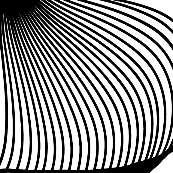
Adobe Illustrator CS4 Swirl Tool Tutorial

I found this tutorial to be mostly helpful. On a scale of 1-10 I would rate this tutorial a 6. I would give it this rating because it made sense in the beginning but it got confusing after the 2nd or 3rd step. The image above is not what the tutorial said it would look like. This is the result of me exasperating a little bit and my tech teacher, we'll just call him "coach" teaching me some other tricks on illustrator that went along nicely with what i already had.
How this finished product was made was by following the tutorial for the first two steps then using the rotation tool, copy and paste/ alt,command arrow key right.
Click here to go to the robcubbon tutorial I used
Saturday 8 September 2012

Subscribe to:
Posts (Atom)