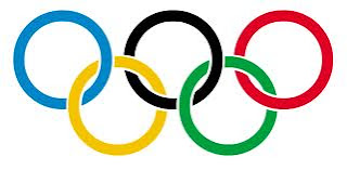
The first logo I am analysing is the Olympic logo. This logo is an abstract logo because it isn't a picture of anything and it doesn't have any text. This logo has many colours, circular shapes and a very balanced feeling. I think the designer used many colours to display a sense of diversity because the Olympics is a global, welcoming and diverse competitions. I think the circular shapes are to represent a welcoming and friendly feeling. The circles being connected, I think is to represent happy and diverse people coming together as one. I think the target audience is everybody world wide. Te reason for this is because not everyone would see this logo the way I have described it ,but I think everyone would understand its purpose and know that it is meant to be a happy and welcoming thing.
The second logo is the Seventeen Magazine logo. This logo has one very bright colour and no emphasis or value what so ever. It is has balanced and rectangular shape and form. This logo is a typographic logo. I think the reason this logo is bright and bold is to grab peoples attention. I think the reason there is no value is because it is a typographic logo. I think the balance in the logo os to make it easy on the eyes and to look proper and uniformed. I think the rectangular shape is because this logo runs across the top of a magazine which is also rectangular. I think the target audience is modern day young women the reason for it is because if the colour and the font.
The third logo is the Canadian TD Bank logo. This logo is an abstract typographic logo with retangular logo with thick rectanguler strong colours and shape. It is ment to appeal for bissness men and


No comments:
Post a Comment