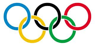
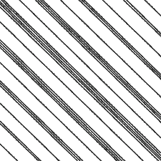
The first logo I am analysing is the Olympic logo. This logo is an abstract logo because it isn't a picture of anything and it doesn't have any text. This logo has many colours, circular shapes and a very balanced feeling. I think the designer used many colours to display a sense of diversity because the Olympics is a global, welcoming and diverse competitions. I think the circular shapes are to represent a welcoming and friendly feeling. The circles being connected, I think is to represent happy and diverse people coming together as one. I think the target audience is everybody world wide. Te reason for this is because not everyone would see this logo the way I have described it ,but I think everyone would understand its purpose and know that it is meant to be a happy and welcoming thing.
The second logo is the Seventeen Magazine logo. This logo has one very bright colour and no emphasis or value what so ever. It is has balanced and rectangular shape and form. This logo is a typographic logo. I think the reason this logo is bright and bold is to grab peoples attention. I think the reason there is no value is because it is a typographic logo. I think the balance in the logo os to make it easy on the eyes and to look proper and uniformed. I think the rectangular shape is because this logo runs across the top of a magazine which is also rectangular. I think the target audience is modern day young women the reason for it is because if the colour and the font.
The third logo is the Canadian TD Bank logo. This logo is an abstract typographic logo with retangular logo with thick rectanguler strong colours and shape. It is ment to appeal for bissness men and
Monday, 24 September 2012
Monday, 17 September 2012
Repetition & Rhythm Assignment

I created, in the first comp, a rhythm that becomes greater
and then smaller again. I did this by using oblique lines in a
1-1,2-1-1,2,3-etc. In my second comp I created a steady rhythm that gets
greater and thicker longer it lasts. I did this by using a curved line that I
copied and repositioned 26 times. As the lines get more curved the beat is
getting louder/thicker. I think my first comp works because you could actually
clap it out, even though it looks like a magnified suit pattern. I think my
second comp works because it is more of a visual representation of a beat
getting thicker, but it is clear that the curve in the line is getting greater
and greater and if I was to clap it out for you the beat would be getting
thicker and louder. I think my first comp works because it is more obvious and
doesn’t need as much explaining as the second one. I think they are both
pleasing the eye because I think to the untrained eye ,who
had no idea the
purpose of the assignment they would just see lines.
Friday, 14 September 2012
Art Critique of Emily Carr's Reforestion
 In terms of
Imitationalism the painting does not
have many literal qualities, but Carr's use of shape and colour blending does
display some realism. The line and shape
of the painting is to perfect. What I mean by this is, a tree isn’t a triangle.
There is more to the tree than that. I think it is the imperfection in nature
that makes it beautiful. Although I am in no way saying that the painting was
unsuccessful.
I think
that Carr did a great job at portraying a Meaning without forcing the meaning.
I think she used line, balance and shape very well. Creating a sense of calmness and
serenity, but still, I think , displays empowerment and respect towards the
tree. I think her colour palette is sort of dark, but with some light hues, this creating value and emphasis. I think the reason for this
is because Emily Carr may have some anger or sadness towards the way people
treat the trees and disrespect nature. I think in terms of general meaning
Emily has a great love for nature and is not pleased with the fact that not
everyone has that same feeling. I think this painting and many of her other
paintings are her expressing her feelings about this subject.
The
Emotionalism displayed in this
painting is dark, gloomy almost like nighttime. The painting although still has
a feeling of peaceful content. I think this stems from the use of horizontal
lines throughout the whole painting. In
some parts of the painting, Carr uses lines of texture to show the roughness
in the bushes. The sky is dark as if dusk or nighttime but there is no moon. I
think the reason for not having a moon is because a moon could imply mystery. I
don’t think that is what Emily was trying to portray with this painting.
My Opinion is that Carr used colour to show
light in an amazing way. I think this because the way uses the amount of line and
texture she used it can be come difficult to do. I still think that she could
have mad it more clear weather or not it was night or day, dusk or dawn.
On another topic I think this
painting is interesting because most times the objects in the foreground are
larger and the objects in the background are smaller. This displays depth. Now
the reason for this could be because Carr didn’t paint this from ground level
or it could be another way she displays greatness in the trees and mountains.
There is contrast in this painting, but I think that there is emphasis on this
middle ground. I know this because the lightest section of the whole painting
is the trees in the middle.
Adobe Illustrator CS4 Swirl Tool Tutorial
I found this tutorial to be mostly helpful. On a scale of 1-10 I would rate this tutorial a 6. I would give it this rating because it made sense in the beginning but it got confusing after the 2nd or 3rd step. The image above is not what the tutorial said it would look like. This is the result of me exasperating a little bit and my tech teacher, we'll just call him "coach" teaching me some other tricks on illustrator that went along nicely with what i already had.
How this finished product was made was by following the tutorial for the first two steps then using the rotation tool, copy and paste/ alt,command arrow key right.
Click here to go to the robcubbon tutorial I used
Saturday, 8 September 2012
Subscribe to:
Comments (Atom)


