After viewing the videos linked to me from the CyberARTS blog I have concluded that music videos over the decades have moved farther and farther away from being an entertaining visual with the music to now be separate works of art in their own right.
I consider some of the more recent ones works of art as apposed to past ones. Even though some of the past videos for example talking heads were used in art shows I still believe that people only thought they were fantastic because they were using new technologies, not because of artistic value.
Obviously the quality and sophistication of the videos have increased over the decades as people have gotten better at using them and they have improved themselves.
Arcade Fire as improved from the decades because it has full branched out from happy people dancing to the music and has full told a story separate to the music.
In my opinion music videos are going to continue to become more and more pieces of their own and no longer be created to accompany the music, but the other way around.
Thursday, 23 April 2015
Wednesday, 8 April 2015
Daily Create #5

Tuesday, 3 March 2015
Daily Create #4
Interesting shot of a plastic object I've used today. Thought it was an interesting view of a water bottle.


Daily Create #3
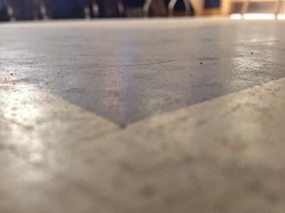
An interesting slice of of the dirty grid tiles we have the lab here at CyberARTS! :p

Daily Create #2
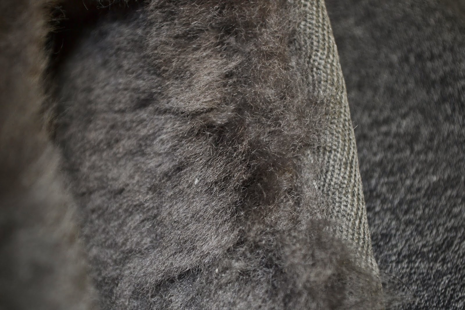
Another Fabric. I chose to do this because I really like knit material because of how much it can very. Needle point size,knit and pearl. There are so many different ways to do it.


Monday, 9 February 2015
Wednesday, 4 February 2015
Logo Design

This logo meets all of the five principals of effective logo design. The first is simple and this logo is defiantly that. With just one colour used not including background this logo could go from screen, to print, to even stamp if the company were to choose. This also makes the logo versatile. The logo has some small details, but they are not complex or necessary to the logo which still allows for resizing. In my opinion the logo is timeless because the imagery is so symbolic and common. I do believe the logo to be appropriate for the company as they specialize in selling organic fruits and the theme and imagery of the logo are both very natural.
The logo is very balanced only because the bird is standing on the middel of the log and the text within the log is centered. Only natural lines and used which is appropriate as the company is all about organics. Although the logo is balanced it is not symmetrical which i think is great as it is ascetically pleasing.
This logo meets all of the five principals of an effective logo. It is obviously simple and and memorable. It is versatile because of its simplicity and it is obviously timeless as its a symbol that everyone could recognize and it doesn't tie into anything special to the current time. It is appropriate because it is a continuation of the company's name twitter.
Despite the asymmetrical design the logo is still balanced because the end of the tail is just as far from the center as the end of the beak. It is all one colour thats is not to bright or overpowering and at the sametime is not to dull.
Monday, 16 June 2014
Video Self Portrait - Culminating
The video starts with my morning alarm that wakes me up in the morning and ends with my drive home from school. I ended the piece at that end of my school day because it is the longest part of my day hence the title.
Some shots are blurry for example the morning alarm shot. I did this to visually represent the parts of my day that are most exhausting, confusing, and tiring. I did not add any extra music to my video because I felt that the normal sounds and voices of my day would be the best fit.
The only exception to this was an enhanced alarm sound at the beginning of my day.
My video has a title intro to start, but abruptly ends I did this because the start of my video is that start of my day, but the end of my video isn't that en of my day it is just the end of the longest part of my day.
Thursday, 22 May 2014
"I shall call him squishy..."
In my story board I planned to have the text spiral out at the end instead of flick to right. But i couldn't make this work out the way I wanted to. I tried but i couldn't make it look the way I wanted it to.
I over came this challenge by changing my original design to something simpler and something I knew I could over come.
This is my completed work over to the right. Enjoy!
Monday, 12 May 2014
Mini Photo Portfolio from Downtown Toronto using
 |
| Depth of Feild |
 |
| Contrast |
 |
| Dominance |
 |
| Dominance/Contrast/LeadingLines/Depth of Feild |
 |
| Rule of Thirds |
 |
| Leading Lines |
 |
| Colour Contrast |
 |
| Rule of Thirds |
 |
| Rule of Thirds/ Contrast |
 |
| Rule of Thirds |
Thursday, 6 March 2014
Principles of Animation with Kentic Typography
i) (0:00-0:07) right at the beginning of the video and throughout there are many excellent examples of timing within an animation. An animation must coordinate with its sound or else the video will look off, unprofessional and most likely make the viewer confused
ii) (0:17) The angry bird that flies across the screen flies at an arched angle. This arch gives the angry bird and more realistic movement considering that it is being launched into the text.
iii) (0:19) Once the angry bird hits the text there is a following secondary action where te bird falls back onto the invisible ground. Secondary actions are important to make an animation more realistic.
iv) (0:17-0:18) The angry bird also flies in at a fast pace that later slows down. This is the slow in slow out technique that again makes animations a lot more realistic.
v) (0:23) This is an excellent example of staging because of ow it swings in the words and makes a bigger impact.
vi) (0:31) There is a good example of follow trough as the calendar sheet swings back and the forth again following through with a full swinging action.
vii) (0:45) The is a large exaggeration on the word try here. This is because it makes it look better as it matches better with the sound. Because in the sound the word try is also exaggerated.
viii) (2:13) Right here as the salade falls onto the text scale there is a moment of anticipation as the viewer knows that there will be a secondary action of the scale levels out.
Tuesday, 18 February 2014
Adobe Illustrator CS6 Lotus Drawing
 |
| Final graphic image in png file format |
 |
| Original image used |
I saved my final file as a png file. I did this because png
is a lossless file format. This means that a png file looks for patterns in the
image to create algorithms to save file space; instead of saving each
individual pixel. The compression that occurs in a png file is reversible so it
can be recovered exactly.
The first step I took to create this image was to first find
a jpeg image that I felt would be capable of coping in Illustrator. Once I
found my image I drag and place it into the first layer of my file. I then
locked this layer. I used the pen tool with a gradient colour filter to create
the shapes. I then, using the pen tool, I created shapes on top of the image
mimicking the actual look of the image the best I can. I used gradient tool to
create realistic light and shadow throughout my image. Once I was done I
dragged, placed and resized some shapes that I had create on top of my original
image to fill in wholes and to make it look more realistic. Lastly I saved as a
png.
Once I had fully completed my image, before saving I noticed
there were plank spots in between my created shapes. I noticed this once I took
away the original image I was layering everything on top of. This was
challenging because I really didn’t know what to do about this except start
over. But realizing that I did not have very much time left I felt the best
decision t6o make was to resize and position some of my shapes to fill in those
gaps.
I am pleased with my final result mainly because I like
original image and I felt I copied fairly well’ except now it looks more like a
graphic instead of a photograph.
Friday, 14 February 2014
Pixel Self-Portrait in Adobe Photoshop CS6
| Gif. file version |
| Png. file version |
After creating this piece I save
the psd. (Photoshop file) two times, two different ways. On the left is the
gif. file and on the right is the png. file. Both images side by side at their
original image size of 100p x 150p look the same without any differences that I
can see. When I zoomed in 5 times and compared them side by side again I did
not see any change, I think this maybe because while creating this piece I kept
my colour pallet to a minimum only using colouring change to show obvious
differences in lighting and colour. I felt this was the best choice because the
original photograph had very warm lighting and a lot of shadows. An example of
this is how my eyes are purple in the pixel portrait yet in real life they are
blue. This is the cause and effect of warm light; it turned cool colours such
as blue into a deep purple.
Originally while creating this I
wanted to accentuate my bright blue eyes, but because of the lighting I was not
able to do so without making colour composition looking very out of place. I
did not want this effect so half way through production I made the decision to
keep my eye colour to the original colour pallet found in the image I was
working on. My hair is pretty much the
same colour of a deep and warm brown. When I am in certain lighting you can see
red undertones shine through my hair I believe that this happened in this
image. Like I had said before the lighting I was in while taking this photo was
very warm and it was also coming from my left hand side. I think that because
of this lighting the red undertones were picked and displayed in the original
photo. The interesting part of this is that while I was examining my photo more
closely to be able to choose colours as close a possible to the original photo,
I noticed that the red undertones did not come through as red but instead a
very deep purple. I find this colour change very interesting. While creating my pixel portrait my main goal
was to accentuate the original and natural colours of the photos while at the
same time keeping it simple. I was hoping this would give an interesting
effect. I feel I have succeed.
As far as my technical procedure
goes I used a photograph that I had previously taken without knowledge of this
project. I took the picture my self (selfie) about two weeks before. I created
an rbg file in Photoshop with a white background and 100 pixel by 150 pixel perimeters.
I dragged the original photo into Photoshop through my desktop, positioned and
sized it to my liking and then locked the layer. I worked on top of a single
layer from then on applying each pixel using the pencil tool in a one pt. size.
(Yes I applied 15,000 pixels; it wasn’t as
difficult as one may think) I worked on one layer because then I could go over
pixels that I have previously place in to the fastest and most effect way. I felt time was important because I only has a
few days to apply 15,000 pixels. Also because the file was only 15,000 pixels I
knew that my file was not going to get overly large or contemplated. I selected
my colour by using the eyedropper tool to pull colour from my original photo. I
chose the colours by analyzing my photo and pulling the colour that I could see
was appearing the most in a particular area.
Monday, 10 December 2012
Tech.Post #9 (3-6-9) Assignment
Wednesday, 28 November 2012
Tech. Post #6 “How do I create a photographic art piece, in the surrealist style, that has a meaningful message?”

I
created a photographic art piece that displays many of the elements and
principles of design, but some of the most relevant principles I used were,
unity, contrast and well-used colour balance. I used mainly used organic
colours, which have the tendency to compliment each other. I used the black
background not only as part of my meaning, but it also compliments and unifies
the black and other not so organic colours in the motherboard. I used colour to
create contrast with the globe, grass and motherboard. I didn’t realize until I
put all my photos in the image that the colours contrasted and unified the
image, it wasn’t intentional at first, but once I realized it was a possibility
I went for.
I
used the surrealist style in two big ways. The first way was instead of a
satellite image of the earth, I used a globe and aimed hot lights at it to try
and simulate the way the suns rays and light fall upon the earth. The other way
I used surrealism was with the grass and motherboard on South America and
Africa.
The
message behind my piece is very simple, but does need some explaining. My
message is that with all the new technologies, we are destroying our natural
world to create a tech. world. The background is black because as far as human
kind knows, after we destroy earth we won’t have anything else. Nowhere else to
go or live and we will all die faster then we think. Not many people our
focused on changing our bad habits of because they like the fact that they can
hide behind their phone and not have to face the truth. Just as I manipulated
my photos into one photo, mankind is manipulating our natural resources and the
ability to use the Internet for what it’s meant. Information. Not for
Misinformation. I used the grass on
Africa because a lot of Africa is still living of the land and Mother Nature. I
put the motherboard on the Americas because they are a lot more tech forward
then other parts of the world and is North America doing a lot of the damage
and just not carrying.
In
terms of the technical aspect of my photo I have one major flaw I would like
improve, a problem I overcame and the discovery of new Photoshop tools that I
found to be not only interesting, but every helpful too. The major flaw I
notice was in the early stage of photography when I took the picture of the
globe and didn’t get all of the globe, I attempted to fix this by lowering the
globes position on my image so it would look more intentional. Next time I do
an assignment similar to this is make sure my object is fully in lense and maybe
using the cove. A problem that occurred
but I managed to overcome was I didn’t take the photos with the same light
source this became a problem once I started to layer the images. I fixed this
problem by lining up all the light sources to make it unnoticeable. I
discovered and was taught quiet a few more tools in Photoshop that I fond very
helpful while making this image. One of these tools was the mask. I helped me
not destroy my images, but still be able to remove backgrounds. I also really
liked the blending modes where I could make something transparent and make it
exactly how liked it to be. The technical and production of my image I found to
be both fun and informative.
Monday, 22 October 2012
Post #5 Composition in Photography

I think my image is visually interesting because of the angle the image was taken, the use of rule of thirds technique and the bright and rich colours. The angle the photo was taken isn't parallel to the goal post. This is visually interesting because even though the back post line is on an angle it is still following the rule of thirds. Another way this image is a display of the rule of thirds is because the object of the image(the girl in the pink sweater) is on the right hand bottom cross line of the 9 boxes. When the image was taken the focal point was not on the rule of thirds, using photoshop I cropped the image to create this.The girl is also a focal point because her pink sweater creates great contrast against the whole image and its organic colours. These colours used to be washed out, but with the help of photoshop and the use of colour boost I made the colours look richer and brighter, like a very sunny day, even though this image is was taken on a cloudy day. I took this image with the intent of the pink sweater making pop and I think after my photoshop edit I made my intent even better. I wanted to display dominance while still adding other compositional techniques to make my audience really look further, but look further in a certain order which I control with the dominance displayed in the image.
If I could retake this image I would take it from a lower angle, so the viewer could see the expression on my focus's face. I might use photoshop in a different way and play on the fact it was a cloudy day. Maybe create an image of loneliness or sadness instead of just high contrast sunny day simple everything is okay kinda fell.
Chess Piece Drawing Review


 The image above is a drawing of a chess piece and a background which is a play on the grad technique used to draw images in an easier simpler way. As part of my assignment I had to try different techniques to copy my hand drawn work into a digital for in the most successful way. This is why I have three images of the same drawing. The first one is a scan image with some photoshop improvements. I think this was an effective way to copy my work because a photograph a it sometimes creates a shine from the burnishing and adds a highlight that shouldn't be there. The second image is a photograph of my image using a copy stand. I do not think this was an effective way to copy my work for two reasons. One, the bright hot lights create a yellow tint on my drawing which is not supposed to be there. Secondly, the bright lights also create an extra highlight by flashing back light right into the camera lens where there is some burnishing. The third image is another photograph taking outside where there is softer light. This way my I wouldn't get the yellow tint or the burnished highlight. I think this technique was more effective than the copy stand, but for this specific image I think that the scanned image was the most effective. I think this because the scan image captured all of my detail, while the outside image did not.
While I was planing this drawing I wanted to make it visually interesting. I did this by modifying the technique of drawing with a grid. I drew the pawn using a grid and then took individual sections of the grid and copied them somewhere else on the page. Sometimes rotating or flipping the section to make the viewer look further. I used value to show light. I think I did this well because my drawing has large value scale with deep blacks and shades of white. The lines used in the chess piece its self are very confident and polished. While the lines used to draw the grid are confident and polished, but are very light because I had originally had the intensions of erasing those lines but once the piece was finished i decided that it would be best if the lines stayed.
Thursday, 11 October 2012
Tech. Post #4 Composition in Photography

www.corbis.ca
This picture displays movement in a very interesting way because the first windmill is appearing still, but as your eyes move to the right the windmills appear spinning faster. This picture does a great job of displaying different levels of movement and the effects it has on an image. Not only does an image blur the faster the movement,but it also may appear different. All three of these windmills are identical,but the last one looks smaller than the middle and so on and so forth.

www.corbis.ca
This picture does an amazing job of framing the target piece. It ties in the colours so it is easy on the eye. The framing is done very very well because it does not absorb any of the focus from the focal point, but just highlight it in a very clever way. The colour contrast and blend is really good at, again framing the image in a very clever and artist way.
Worked with: SeaOfBlue
Worked with: SeaOfBlue
Wednesday, 10 October 2012
Tech. Blog Post #3

This picture is titled "Stand Out". I titled it this because on a field trip in gr.7 to high park where my class and I took pictures of humans interacting with natural environment, this pink ribbon just stood out to me and I took the picture. Now looking at this picture two years later I see why the ribbon stood out to me. It is because the colour contrast between the hot pink and yellow,green leaves. I find this visually interesting because there is hues of red which I find ties in the pink so it is more appealing to the eye.
Subscribe to:
Posts (Atom)